React Component Mindset
Think of a React app as a tree of small, purposeful functions. Data moves down via props, intent bubbles up via events. Reuse comes from sharing logic (hooks) and structure (composition). Keep concerns tidy; let each piece do one job well.
1.1 Thinking in Components & Composition
Break the UI into components with a single clear responsibility-button, card, list, section. Then compose them like Lego. Prefer composition over inheritance: pass UI fragments in as props rather than subclassing.

Start with pure, stateless pieces; add state only where necessary. Small, stable APIs beat sprawling prop bags.
1.2 Props, Children, and Reusability
Props are inputs and read-only-never mutate them. The special children prop enables flexible layouts and “slots”.

For reuse:
- Prefer data + callbacks over hard-coded behaviour.
- Keep prop surfaces narrow and intention-revealing.
- If hierarchies get deep, avoid excessive prop drilling; use context at a sensible boundary.
1.3 State Ownership & Data Flow
React’s data flow is one-way. Place state where it’s used; if siblings need it, lift to the nearest common parent. Distinguish carefully:
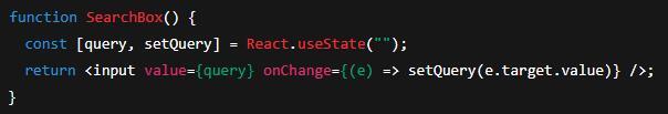
- Local UI state (toggles, input text) →
useState/useReducer. - Server/cache state (fetched data, background updates) → a data layer (e.g., TanStack Query) or framework features. Don’t mix it into arbitrary components.
Keep state minimal and derived where you can (compute filtered lists from a single source of truth). Duplication invites bugs.
1.4 Container vs Presentational Components (and modern takes)
The classic split:
- Presentational: pure, receive data via props, render markup.
- Container: fetch/prepare data, wire events, pass props down.
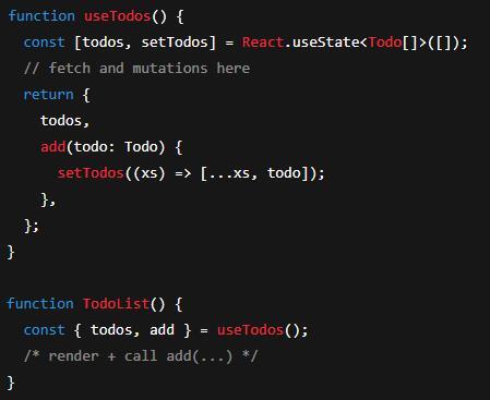
Modern React leans hooks-first:
- Put side-effects and data orchestration in custom hooks (e.g.,
useUser, useTodos). - UI components consume hooks and stay focused on rendering.
- With server components/SSR, some data loading moves to the server, further shrinking the need for explicit “containers”.
1.5 Cohesion, Coupling, and Boundaries
- Cohesion: each component/hook should do one thing brilliantly (e.g.,
Avatar renders an image; useAuth manages auth). - Coupling: hide internals; communicate via props, callbacks, and context. Don’t let unrelated pieces reach into each other.
- Boundaries:
- UI boundary: presentational components shouldn’t fetch by default.
- Data boundary: fetching, caching, retries live in hooks or a dedicated data layer.
- Module boundary: group related UI, hooks, and tests by feature.
Smells: god-components that fetch, validate, transform and render everything; vast prop objects; duplicated state.
1.6 Patterns: Render Props, HOCs, Hooks-First
Render Props
Share behaviour by passing a function as a child.
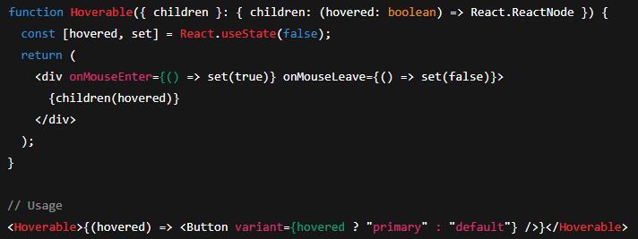
Pros: explicit, flexible. Cons: can nest deeply and harm readability.
Higher-Order Components (HOCs)
A function that wraps a component and returns an enhanced one.
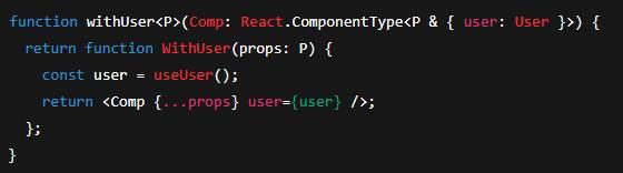
Pros: cross-cutting reuse. Cons: wrapper chains, trickier typing, forwardRef/displayName gotchas.
Hooks-First (Recommended)
Encapsulate reusable logic in custom hooks and keep components lean.

Why this first? No extra nodes in the tree, highly composable, TypeScript-friendly, and easier to test.
Rules of Hooks (non-negotiable):
- Call hooks only at the top level of React function components or other hooks.
- Never call hooks conditionally or inside loops.
In Short
Start small and pure. Compose freely. Put state where it belongs and lift only when needed. Use hooks to share behaviour; reserve render props and HOCs for edge cases. Keep cohesion high, coupling low, and boundaries crisp. Follow the Rules of Hooks, and your components will stay predictable, testable, and pleasantly boring-in the best possible way.
Here’s a key for the acronyms used in the article:
- UI - User Interface
- API / APIs - Application Programming Interface(s)
- HOC / HOCs - Higher-Order Component(s)
- SSR - Server-Side Rendering
- HTML - HyperText Markup Language
- TSX - TypeScript JSX (TypeScript-flavoured JSX file format)
- ARIA - Accessible Rich Internet Applications