Animations & UX Polish
Thoughtful motion makes interfaces feel responsive, intentional, and trustworthy. In React, two mature libraries cover almost every need:
- React Spring - physics-based springs for natural, fluid motion.
- Framer Motion - declarative animations with variants, layout transitions, and gesture support.
Below is a concise, accurate guide to their basics and to the transition patterns and micro-interactions that lift a product’s UX.
14.1 React Spring / Framer Motion Basics
React Spring (physics-first motion)
When to use: You want motion that settles like a real object-snappy yet smooth-without hand-tuning easing curves.
Core ideas
- Springs, not keyframes. You specify where values should end up; springs decide how they get there.
- Hooks and animated elements. Animate styles and transforms on animated.* components.
Essential APIs
- useSpring - animate a single object of values.
- useSprings - animate a list where each item has its own spring.
- useTransition - animate items entering/leaving (mount/unmount).
- useTrail - staggered springs with a natural follow-the-leader effect.
- animated - DOM/SVG elements upgraded for animation.
Minimal example (toggle expand):

Practical tips
- Prefer animating transform and opacity for performance.
- Tune with config (mass, tension, friction) for “buttery” vs “bouncy”.
- For lists, useTransition cleanly handles enter/leave without manual timers.
Framer Motion (declarative, variants, gestures)
When to use: You want expressive UI motion with enter/exit, variants, layout transitions, shared elements, and gestures (drag/hover/tap), plus easy orchestration.
Core ideas
- motion.* components wrap DOM/SVG elements (e.g. motion.div).
- initial / animate / exit govern lifecycle motion.
- variants centralise states for multiple elements.
- AnimatePresence animates unmounting components.
- Layout & shared transitions via layout and layoutId.
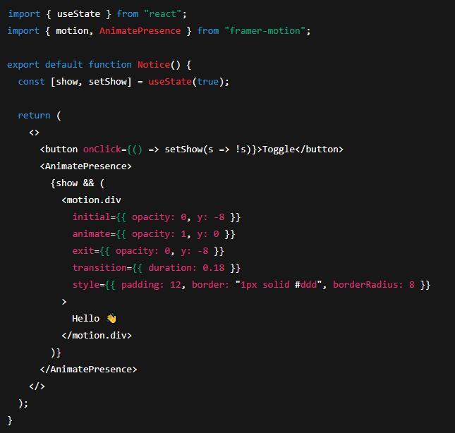
Minimal example (fade/slide with exit):
Variants & orchestration (staggered list):

Layout / shared element transitions
- Add layout to smoothly animate size/position changes.
- Use matching layoutId on two elements across navigation to create a shared element transition.
Gestures
- whileHover, whileTap, drag, dragConstraints, dragElastic provide direct, declarative interactions.
A11y & preferences
- Use useReducedMotion() to respect users who prefer reduced motion and simplify or disable animations accordingly.
14.2 Transition Patterns & Micro-interactions
Route & Page Transitions
- Enter/exit choreography. Wrap routed content in AnimatePresence to fade/slide pages rather than cutting.
- Shared element emphasis. Carry focus from a list item into its detail view with layoutId.
- Duration discipline. Keep page transitions short (≈150-250 ms) to feel responsive.
Mount/Unmount of UI Regions
- Panels, modals, toasts. Animate both backdrop and content; decouple timings (quick backdrop fade; slightly slower panel scale+fade).
- Focus management. After opening, move focus inside; on close, return focus to the trigger.
Lists, Feeds, and Reordering
- Staggered reveals (10-60 ms between items) guide the eye without grandstanding.
- Layout transitions (layout in Framer Motion or useTransition in React Spring) soften reorders, inserts, and deletes.
Micro-interactions that matter
- Hover affordances. Subtle scale (≈1.02), shadow, or tint signals clickability.
- Press feedback. Shrink by ~2-3% or reduce shadow during press (whileTap), then spring back on release.
- Focus states. Always show a clear, accessible focus ring; motion should support, not replace, visibility.
- Validation nudges. For errors, a brief shake (small x oscillation) or a colour shift draws attention; pair with screen-reader messaging.
- Loading states. Prefer skeletons or a progress shimmer for perceived performance; avoid endless spinners without context.
- Optimistic actions. Animate success quickly (tick, colour lift), then settle. Revert gracefully if the server rejects.
Pattern snippets
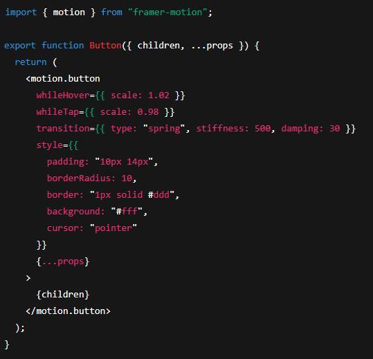
Button micro-interaction (hover/tap):
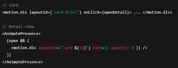
Shared element card → detail:
List add/remove with React Spring:

Performance & Polish Checklist
- Animate transforms/opacity; avoid layout-thrashing properties (e.g. top/left, or width/height where possible).
- Batch work; avoid heavy JavaScript during active animations.
- Keep motion short and purposeful (100-250 ms for UI feedback; 250-400 ms for larger transitions).
- Stagger lightly (≤80 ms steps) to guide attention without delaying interaction.
- Respect reduced-motion preferences (media query or useReducedMotion()).
- Consistent easing. Springs for natural feel; otherwise choose a small, consistent set of cubic-beziers across the app.
- Don’t block input. Transitions should be interruptible; avoid locking the UI behind timers.
Choosing the right tool
- Framer Motion for page/route transitions, shared elements, gestures, and quick declarative setups with variants.
- React Spring when you want nuanced, physics-based motion or very fine control over how values settle.
Used well, motion clarifies structure, confirms actions, and adds just enough delight-without getting in the user’s way.
Here’s a quick acronym key for the article:
- UX - User Experience
- UI - User Interface
- DOM - Document Object Model
- SVG - Scalable Vector Graphics
- a11y - Accessibility (numeronym: “a” + 11 letters + “y”)
- API - Application Programming Interface
- TSX - TypeScript + JSX (React component file extension)
- ms - Milliseconds (time unit)
- ID - Identifier (e.g.,
layoutId)